Size Modifier
Last updated: January 2, 2025
The Size style modifier allows you to control the dimensions and alignment of components. These controls allow you to precisely define how components occupy space on your page. Let's explore each aspect of the Size modifier in detail.
Width and Height Options
The Width and Height settings define how much space a component occupies on the page. You can choose from three options:
Fill: Expands the component to occupy all available space within its parent container.
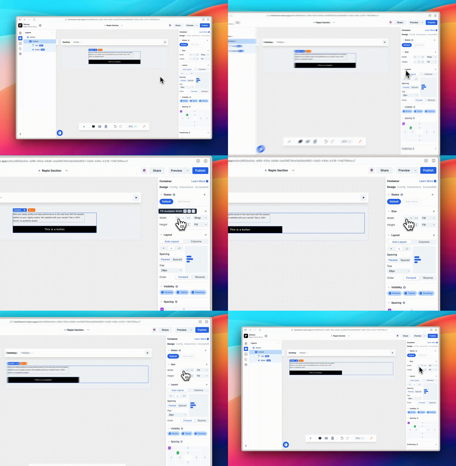
Wrap: Automatically adjusts the size to fit the content inside the component.
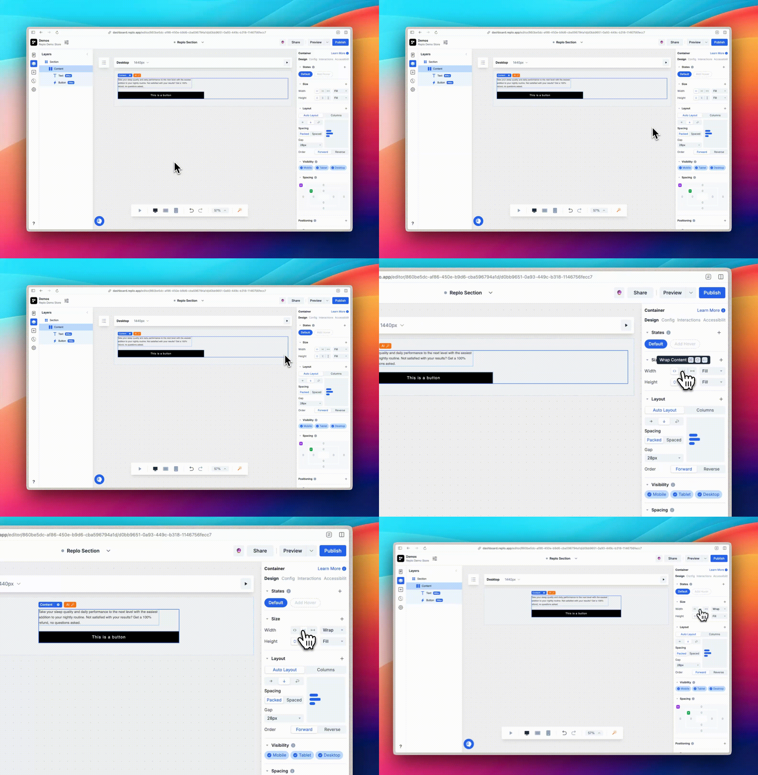
Fixed: Allows you to set a specific value for width and height using pixels, percentages, or any other valid CSS unity.
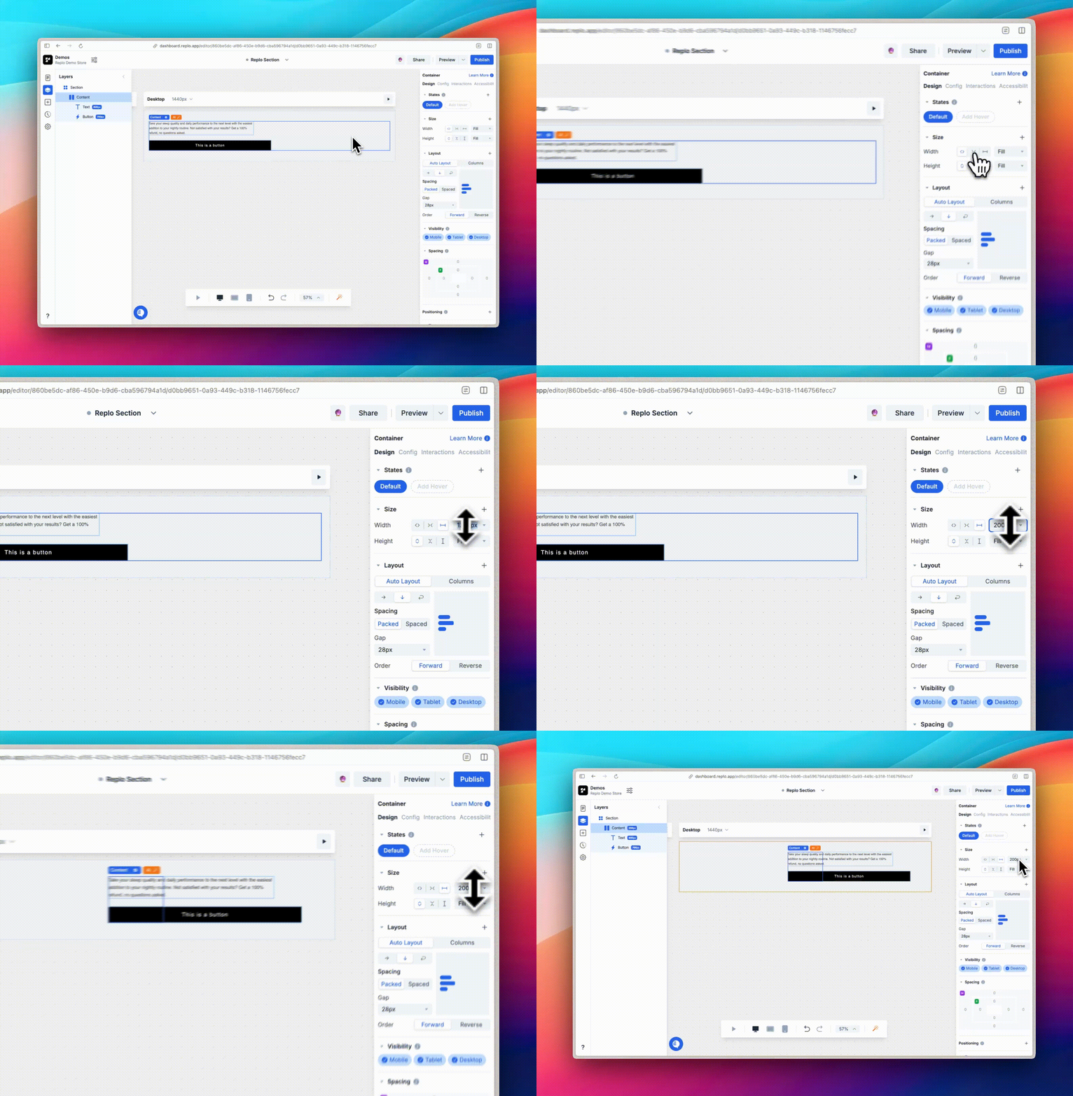
Minimum and Maximum Dimensions
The Min Width/Height and Max Width/Height settings allow you to set size constraints for components:
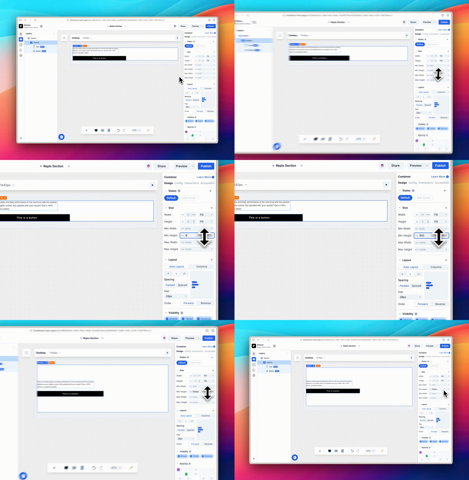
Min Width/Height ensures that components do not shrink below a defined size, useful for maintaining readability or layout consistency.
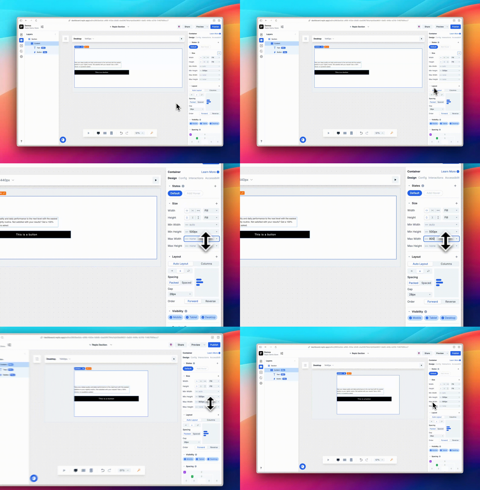
Max Width/Height prevents components from stretching excessively, which is ideal for images or other design elements.
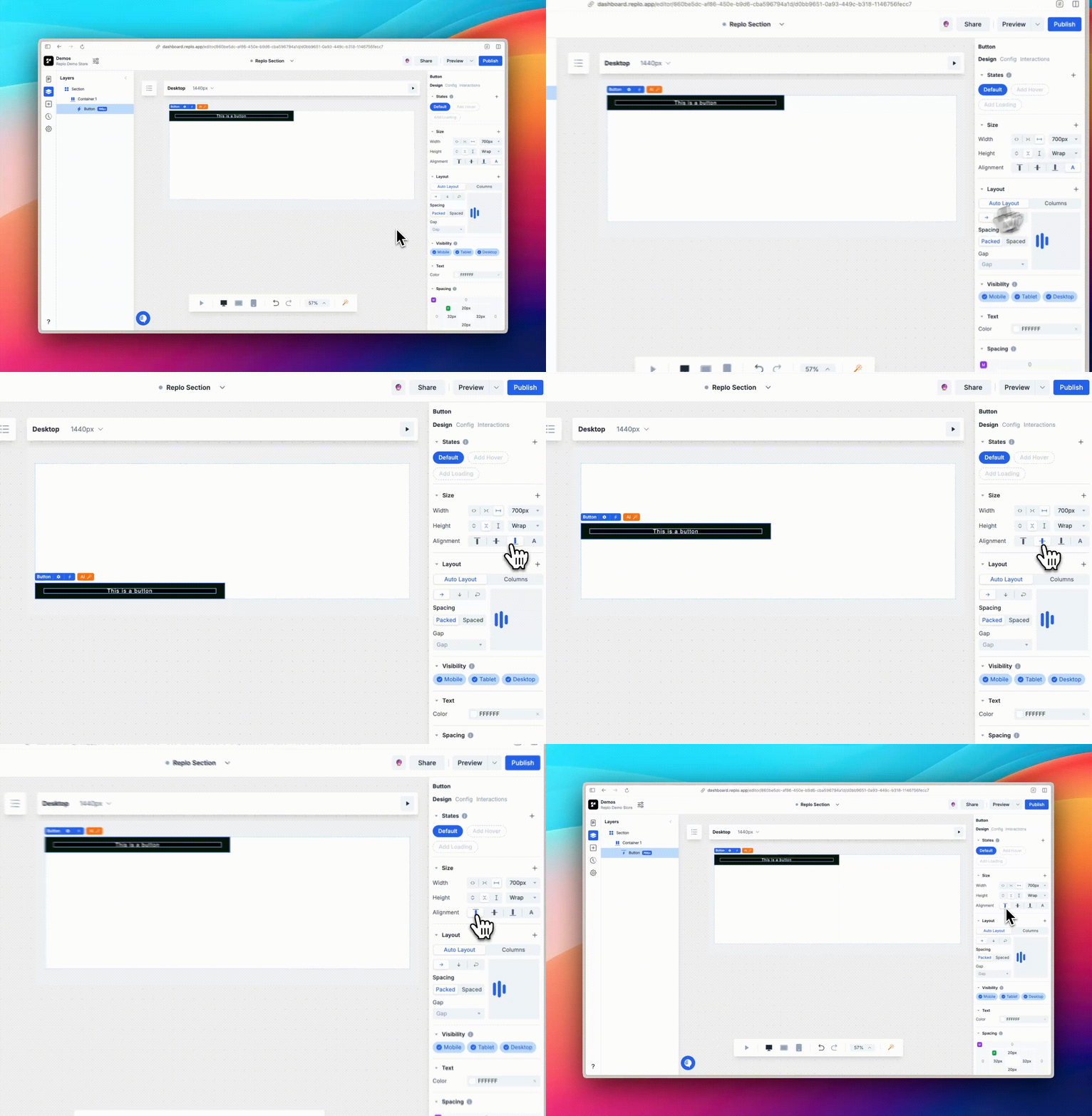
Alignment Options
The alignment controls let you position components relative to their parent component. This means that instead of affecting the overall layout of the page, these controls adjust how a component is positioned inside the element that contains it. For example, you can align a button to the top, center, or bottom of its parent box
