Interactions
Last updated: January 7, 2025
Replo allows you to add interactivity to any component on your page, enabling actions like clicks, hovers, redirects, and more. You can specify actions for when a user clicks on any component in a Replo page.
Adding an interaction
To make a component interactive, find the component you want to make interactive and click to select it. Then follow these steps:
Open the Interactions Tab: On the right-hand side of the editor, click on the Interactions tab at the top.
Choose an interaction type: Select the type of interaction you want to add:
On Click interactions: Triggered when a user clicks the component.
On Hover interactions: Triggers when a user hovers over the component.
Add the interaction: Click the Plus button next to the interaction type.
Set the action: Choose the action you want the interaction to perform. Depending on the action, you may need to configure additional fields (e.g., specify the product for an Add to Cart interaction).
Save the interaction: Once you've configured the interaction, click Save to apply it.
Common Interaction Types
Redirects
Redirect to
This interaction turns the component into a link that opens a different page on your visitor's browser. You can specify any URL, whether it's an internal page on your site or an external website.
For internal links, Replo supports both absolute and relative linking. So both (https://store-myshopify.com/cart) and (/cart) work.
Redirect to Product
This interaction turns the component into a link to the product description page of a specific Shopify product.
Cart Interactions
Add to cart
Adds a Shopify product to the cart. You can specify whether you'd like to automatically direct the user to the cart page or to the checkout directly after adding the product to the cart. You can also select a specific variant or subscription selling plan to add.
You can also add the currently selected variant of a Product component using Dynamic Data.
Clear cart
This interaction clears all items out of the cart.
"Clear Cart" is really useful for things like bundle builders and free gifts, when you want to make sure that the cart has exactly certain items. You can ensure that the cart includes only certain products by adding a "Clear Cart" action directly before the "Add Product To Cart" action.
Adding multiple Items to the Cart
You can add multiple products to the cart with a single component by chaining Add to Cart interactions. This is particularly helpful for offering product bundles or sets, allowing users to add all items to their cart at once. You will also need to make sure that the last Add Product To Cart interaction has the Go to checkout after? option toggled.
Update current product
The interaction changes the product displayed in a Product component to a different one. It's useful for dynamic product displays, such as changing colors or styles without needing multiple components. It can also help with working around Shopify's 100 variant-per-product limit.
Apply Discount Code
This interaction applies a Shopify discount code to your visitor's session, automatically providing the discount at checkout. It's a great way to promote special offers and encourage conversions by simplifying the discount application process.
Activate state
"Activate State" changes the state of a component to a predefined setting. It's great for dynamic content changes, such as showing or hiding elements, changing styles, or toggling menus.
Scroll to a URL hash mark
This interaction smoothly scrolls the user's view to a specific section of the page marked with an anchor or hash mark. It's ideal for single-page sites or when you want to guide users to specific content sections seamlessly. You can read more about hash marks here.
Run JavaScript
With this interaction, you can execute custom JavaScript code. You can use this interaction to add functionality not covered by built in components or interactions, like integrating third-party services. It can also be used to interact with other custom parts of your store's theme, for example to open a slide-out cart.
Component-specific Interactions
Tabs Interactions
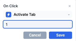
Activate Tab

This interaction activates a specific tab inside a Tabs Block component. For more information about tabs, see Tabs.
Note that the number of the tab to activate is indexed from 0 - that is, to activate the first tab in the list, you put 0 in the number field.
Carousel Interactions
Go to next slide
This interaction moves to the next slide in a Carousel component. It enables users to browse through a series of images or content slides
Go to previous slide
Similar to "Go To Next Slide," this interaction moves to the previous slide in a Carousel component, giving your visitors full control over navigation.
Go to slide
This interaction activates a specific slide inside a Carousel component.
"Go To Slide" jumps directly to a specific slide within a Carousel component. This is useful when you have custom indicators or thumbnails that allow users to select which slide they want to view, or if you
Popup Component
Close Popup
This interactions closes the currently open Popup component. The "Close Popup" action is commonly used on "X" Icons or Close buttons, in order to remove the currently open popup and go back to the normal page.
Advanced Use Cases
Chaining multiple actions
You can chain multiple actions together by adding multiple interactions to a single trigger. For example, you might apply a discount code before adding a product to the cart, creating a custom checkout flow for promotional offers.