Collapsibles
Last updated: January 23, 2025
Replo supports a type of component called a "Collapsible", which can be used to show and hide content. Collapsibles are used for situations when there's auxillary information to be shown, like in FAQ sections where the user has to expand and collapse the answers to each question.
To Add a Collapsible:
Navigate to the page you want to add a Collapsible to in the editor.
On the left side of the editor, click the "Components" toggle, then search for "Collapsible."
Drag the Collapsible into the page.
To Preview Closed and Open States:
Select a component inside the Collapsible you want to edit.
Find the Expand/Collapse icon near the Collapsible's name in the editor preview, then click it to preview the open state of the Collapsible.
If you want to edit the closed state, use the same button again to close the Collapsible.
Rotating arrows when Collapsibles are open
You can add a Replo State which is active when the collapsible is open in order to have an arrow which rotates direction. To do this:
Select the arrow in the Replo editor preview
Add a state using the Add State button in the right bar
Select "Add Custom"
In the State editor, select "Collapsible Is Open"
With the state active, select "2D/3D Transform" in the right bar, then click Rotate, then input the amount of rotation (for example, "180" for 180 degrees).
The rotated state is now active to preview in Preview Mode.
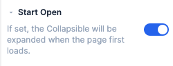
Configuring a collapsible to be open by default
Simply toggle the setting in the Collapsible's Config tab in the right side menu.