States
Last updated: June 26, 2025
In Replo, states are a powerful way to control the appearance and behavior of your components based on specific conditions. They allow you to modify a component’s style dynamically, creating a more engaging and interactive user experience. For example, you can change the background color of a button when a user hovers over it, or display a special banner when a user scrolls to a particular section of a page.
What are States?
At their core, states are a set of styles or behaviors that are applied to a component when a specific condition is met. These conditions could be anything from a user interacting with the component (such as clicking or hovering), to the page reaching a certain scroll point. You can even omit conditions and opt for interaction-based state control using the "Activate State" interaction.
Why use States?
States are incredibly useful for improving user engagement and guiding users through your site. By visually signaling changes, you can highlight important elements, create a more interactive experience, and even control the flow of content based on user behavior.
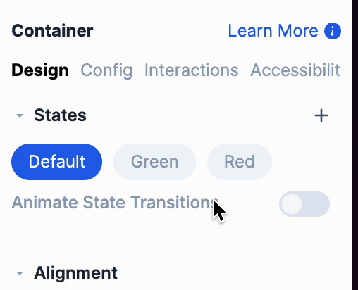
Creating and Managing States
Adding a state to a component
Select the component you want to add a state to, and open the Design tab in the Properties panel.
Under the State section, click on the “+” button to create a new state.
Select a State type (predefined or custom)
For predefined triggers like Hover, select the corresponding option.
For custom triggers, select Add Custom, and define your condition.

Before modifying the styles and behavior for a state, make sure you have the state selected. Any edits you make to this component and its children, will only apply when the state is active.
Managing State Order and Priority
The order of states matters because states are evaluated from left to right. If multiple states could be active at the same time, the first one in the order takes precedence. For example, if you have the following states and style changes, the Red state would technically be active, but won’t show the styles applied to it. This is because the Green state's condition is met first:
Default State - Background is white.
Green State with a pixels from top of page trigger set to "greater than 300 pixels" - Background changes to green.
Red State with a pixels from top of page trigger set to "greater than 600 pixels" - Background changes to red.
To have the Red state's styles appear, reorder the states to have the Red state come before the Green state. You can reorder states be dragging and dropping the states in the order you would like.
State Triggers
There are several different ways to trigger states, each useful for different scenarios. Each of these triggers can be applied to all components
Hover
Activates when a user hovers over the component with their mouse.
Pixels From Top Of Page
Activates when the user scrolls a certain number of pixels from the top of the page.
Pixels From Top Of Viewport
Activates when the user scrolls a certain number of pixels within the viewport. You can read more about viewport here.
Hashmark
A hashmark is the part of a URL that comes after the # symbol. For example, in yourwebsite.com/page1#contact, #contact is the hashmark. Hashmarks are a great way to navigate to or interact with specific content within a page without reloading it. URL hashmarks are configurable on any Container under the Config tab in the Properties panel. You can read more about hashmarks here.
Loading
Activated when an interaction is running in the component, like adding a product to the cart.
No Condition Set (Manual Activation)
You can manually trigger states using the "Activate State" interaction, which can be added anywhere interactions are available, such as on button clicks. This gives you full control over when a state becomes active, making it ideal for features like modal popups or expandable content sections.
Component Specific State Triggers
There are states that can only be used in within components.
Carousels
Trigger | Description |
Activates based on the currently displayed item in a carousel. Awesome for showing item-specific descriptions or features dynamically as users navigate through each item in the carousel. | |
Tabs Blocks
Trigger | Description |
Option Lists
Trigger | Description |
Variant Lists
Trigger | Description |
Selling Plans
Triggers | Description |
Activates when a specific selling plan (a subscription option) is selected. You can use this to create tailored information or callouts to the chosen plan, such as showing discounts for subscription plans or adding special terms. This allows users to see any specific perks or conditions for their selected selling plan option and make an informed choice |
Product Components
Trigger | Description |
Selected Variant | Activates based on a selected product variant. Great for showing variant specific features, such as different descriptions, images, or prices. For example, if a customer selects a particular color or size variant, the page could automatically display corresponding images or unique product details for that selection. |
Template Product (is) | Activates when the product template is being viewed with a particular product. Perfect for customizing the layout or messaging on a product template based on the specific product being viewed. For example, if a template is assigned to a flagship product, you could display exclusive banners, reviews, or tailored content that highlights the unique qualities of that product. |
Product Quantity | Activates based on the selected quantity of a product. Useful for implementing bulk discounts or order restrictions. For example, you can display a message encouraging a higher purchase quantity when the quantity is less than a certain threshold or display a free shipping banner when the quantity exceeds a set amount. |
Current Product | Activates based on the product containers configured product (from the config tab). Helpful for displaying product specific promotions or recommendations on product pages. For instance, if the current product is a specific model, an accessory recommendation can appear for that particular product only. |
No product variant selected | Activates when the parent product container has no selected variant. Helpful for disabling certain functionality until a variant is selected on the product component. Certain situations require the user to choose a variant instead of allowing a default one to be chosen. |
Selected Variant Unavailable | Activates when a selected variant is unavailable. Useful for linking inventory logic from your Shopify store to on-page functionality, such as automatically disabling the “Add to Cart” button when a variant is out of stock. This ensures users cannot attempt to purchase unavailable items, enhancing the shopping experience by providing clear feedback on availability. |
Selection List
Trigger | Description |
Collapsible
Trigger | Description |
Tooltips
Trigger | Description |